As part of a work project, I’ve had to comb through a couple of thousand of food pictures associated with user-generated recipes. Dear food bloggers, could you do me a big favour? Yuge favour?
LEARN TO FUCKING TAKE A PICTURE THAT DOESN’T MAKE YOUR FOOD LOOK LIKE 70’S ERA DOG SHIT!
Seriously! I’ve seen medical textbook pictures that look more appealing! The most obvious crimes I’ve seen are:
– Bad lighting. Really, really, really bad lighting.
– Blurry, out of focus pictures. In this day and age?
– Automated date/timestamp overlaid on the pictures. That might be useful for your family holiday pictures, not not for your food blog.
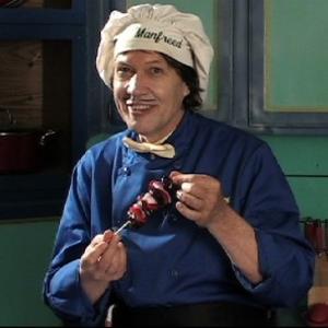
– Content completely unrelated to context. See above picture.
– Ugly plates. Unless the picture was indeed taken in the 70s, nobody should have orange, brown and yellow plates.
– Trying to go completely artsy-fartsy. Just… stop.
– Pictures of brown sludge. Or white sludge. Or beige sludge.
Some – many! – of the pictures I’ve seen make the google image search of “bad food pictures” look like they were taken by professional photographers.
Please. You’ve probably spent a fair amount of time cooking that food. You seem to have a certain amount of pride in it, otherwise you wouldn’t be blogging about it. Why are you shooting yourself in the foot and making it look as unappetizing as humanly possible?

